aSa Mobile

Built for General Managers & Plant Superintendents

Real-time operational visibility, wherever work happens.

Managers need quick access to operational information when they’re away from their desks.

Applied Systems Associates (aSa) builds ERP software for the steel fabrication industry. As part of a five-person CMU MHCI Capstone team partnering with aSa, I led product design for a mobile experience that gives managers quick access to operational information while away from their desks.

Project status: USER TESTED
Problem

Operational information wasn’t always accessible where work happened.

Strategy

Used research to identify where mobility could add value instead of recreating the desktop experience.

Solution

Designed a customizable mobile dashboard around managers’ operational priorities.

Outcome
  • Core mobile interactions validated through prototype testing
  • 2 prototype solutions delivered to aSa
Role
Product Design Lead · CMU MHCI Capstone
Timeline
Jan–Jul 2026
Team
2 Product Designers · Technical Designer · Product Manager · Technical Lead
Tools
Figma · Figma Make · Claude · Notion

01 · Problem

Critical information is only useful when people can access it in the moment they need it.

When construction managers needed updates on their steel orders, getting answers often required a chain of calls or someone returning to a desktop. The information existed, it was just locked inside the system.
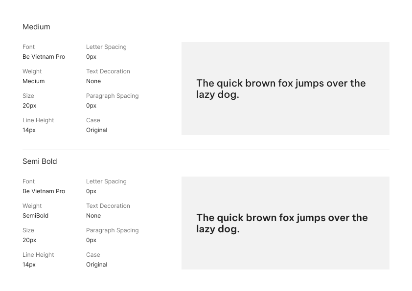
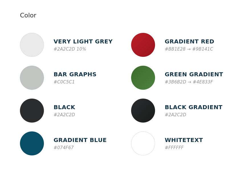
Diagram of communication gaps across the job site, office meeting, shop floor, and desk between Construction Managers, General Managers, and Plant Superintendents
Context

Powerful systems can become difficult to navigate when critical information is buried.

aSa Studio supported complex fabrication workflows across production, shipping, and operations. However, important information was distributed across modules and layers of navigation, leading teams to create their own workarounds for accessing frequently needed insights.

aSa Studio

02 · Research

Research shifted our focus from recreating the desktop to supporting decisions in the field.

We initially assumed mobile should carry aSa Studio’s full capability onto the plant floor. Before designing screens, I led research with manufacturing leaders and consultants to learn what they actually need away from the desk - and what would only add noise.

  • 2

    In-person site visits

  • 6

    Fabrication companies

  • 9

    aSa industry consultants

  • 17

    Field experiments across 5 testing rounds

  • 25+

    Stakeholder interviews

Understanding where mobile mattered

Mobile value depended on the user’s role and environment.

I synthesized our early interviews across user roles and environments to identify where mobile could provide the most value. The pattern was clear: mobile mattered most for managers who moved between locations and needed quick access to operational status.

Chart comparing perceived mobile versus desktop value across roles, with strongest mobile need among General Managers and Shop Managers
Understanding what users actually needed

Users weren’t asking for more data, they needed faster answers.

I then synthesized recurring themes across interviews to understand what information users needed most in the moment. Tracking and status emerged as a strong theme, users weren’t asking for more data, but faster answers to keep work moving and respond when plans changed.

Challenging our assumptions

Research challenged our assumptions about what belonged on mobile.

We entered the summer with three assumptions: users would want desktop-level customization, shop managers would need mobile data entry, and job site logistics should be the primary focus. Testing revealed a different direction.

Table of spring assumptions versus what we tested across dashboards, shop floor, and job site logistics
Vision

The opportunity to extend aSa Studio, not recreate it.

These insights shaped our product vision: create a focused mobile experience that surfaces critical information wherever work happens, while prioritizing what matters most to users.

Diagram showing aSa Studio as the core system extending selected data out to a Mobile App and Customer Portal

03 · Key Decisions

We converged a complex system around what matters most in the field.

We used iterative prototyping and usability testing to determine what information, interactions, and workflows belonged in the mobile experience. Each round helped us converge on a focused set of essentials for managers working in the field.

Research synthesis board with clustered sticky notes alongside mobile UI pattern explorations and sketches
Research synthesis and UI exploration — clustering findings and exploring mobile UI patterns.
  1. Designing for decisions, not a smaller ERP

    I created mid-fidelity Figma prototypes to compare dashboard structures and test how managers could quickly identify important information. We found that desktop workflows were too dense for the field, so mobile needed to surface operational answers rather than recreate aSa Studio.

    Side-by-side comparison of dense desktop aSa Studio navigation and a focused mobile companion dashboard

    Decision

    Designed a focused mobile home around operational answers instead of mirrored desktop information architecture.

    Impact

    Leaders can quickly understand operational health before deciding whether deeper investigation is needed.

  2. Balancing customization with guided flexibility

    I worked with another designer to conduct an open card sort and identify which information managers prioritized most. We found that priorities varied across plants, so the mobile experience needed to support personalization without recreating desktop complexity.

    Side-by-side comparison of a fixed home screen and a personalized home screen with rearrangeable widgets

    Decision

    Created a customizable dashboard using a bounded set of high-value widgets.

    Impact

    Managers can tailor their experience without recreating desktop complexity.

Building a system for mobile

To support a cohesive and accessible mobile experience, I established a reusable design system spanning typography, color, components, widgets, navigation, and icons. The system was built with WCAG AA accessibility guidelines in mind and extended beyond the components used in the final product.

  • Be Vietnam Pro type specs showing Medium and Semi Bold weights for aSa Mobile
    TypographyBe Vietnam ProSelected for its open letterforms and generous spacing, making dense dashboard information easier to scan across mobile screens.
  • Named color palette with hex values for the aSa mobile design system
    ColorAccessible color systemEstablished semantic colors for status, alerts, and actions while meeting WCAG AA contrast requirements.
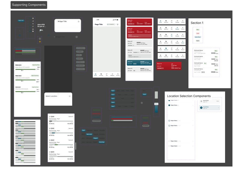
  • Supporting mobile UI components including navigation, widgets, chips, and progress bars
    Components & patternsReusable componentsCreated flexible patterns and states to keep interactions consistent across the mobile experience.

04 · Solution

A customizable mobile dashboard built around operational priorities.

Managers and Plant Superintendents can quickly understand what’s happening, identify what needs attention, and drill into the details needed to respond.

01

Customize what matters

Favorite the widgets you use most to build a home screen around your workflow.

Scroll to continue

Step 1 of 3: Customize what matters

05 · Impact

Making “Where’s my steel?” faster to answer.

I asked fabricators to estimate how much time they could save on common workflows, giving us a way to quantify the potential impact of a mobile experience.

  • 5-15 min

    Estimated time saved per use based on fabricator feedback.

  • 358+ companies

    Fabrication companies served by the existing aSa ecosystem.

  • Launching soon

    Mobile experience moving toward implementation.

What I'd explore next
  • Validate with fabricators

    Test the final workflows with a broader group before rollout.

  • Design for the field

    Explore offline/low-connectivity experiences and accessibility features.

  • Clarify date ranges

    Explore global versus widget-specific date ranges to make time-based operational data easier to interpret.

What I learned
  1. Research starts with understanding the problem space.

    This project taught me to slow down before jumping into solutions. Combining research methods and speaking with users early helped me build a stronger understanding of the product, workflows, and underlying problems before making design decisions.

  2. Design systems require thinking beyond the screen.

    Building a scalable design system from scratch was new to me. It pushed me to strengthen my visual design skills while thinking about accessibility, consistency, and how components could support the product beyond the screens we designed.

  3. Good product design is a team effort.

    Working closely with another designer, our clients, and technical stakeholders taught me to balance user needs with technical feasibility, communicate design decisions clearly, and collaborate toward solutions rather than designing in isolation.